
Steady
Finding your voice,
at your own pace.
A calm mobile experience exploring self-trust, personal reflection and everyday family conversations.
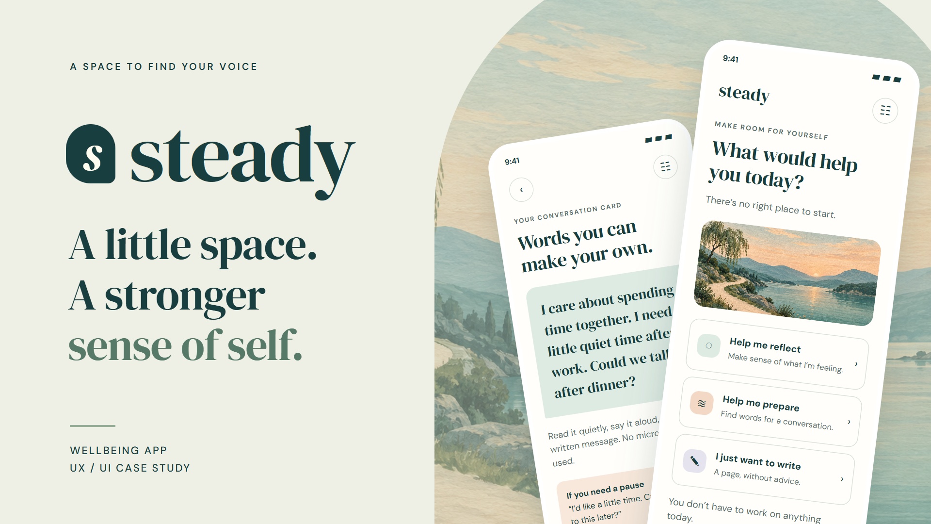
A little space,
in motion.
Watch the Steady concept video. Use the controls to play, pause or view full screen.
Room for your own voice.
This is an independent design concept. Research is proposed; personas, affinity notes and journeys are hypothetical. The scripted prototype is not a diagnostic service or a replacement for a psychologist. No clinical or usability outcomes are claimed.
Select any board to open the full-size image in a new tab.
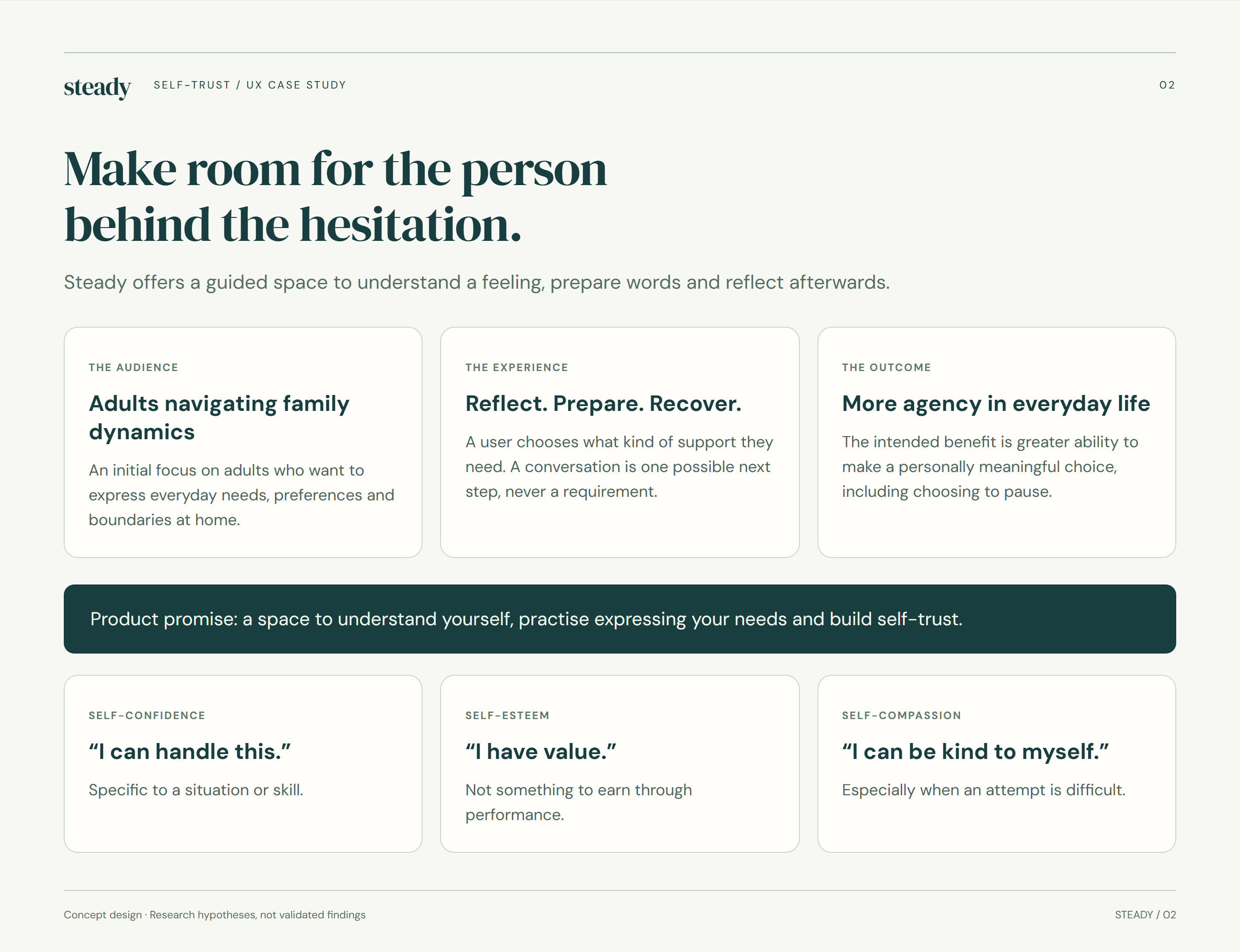
Make room for the person behind the hesitation.
The experience begins with a specific moment: wanting to say something, but struggling to find the words. Steady offers three starting points—reflect, prepare or write—so users can choose the kind of support that fits their situation. The aim is to make the next step feel more manageable.
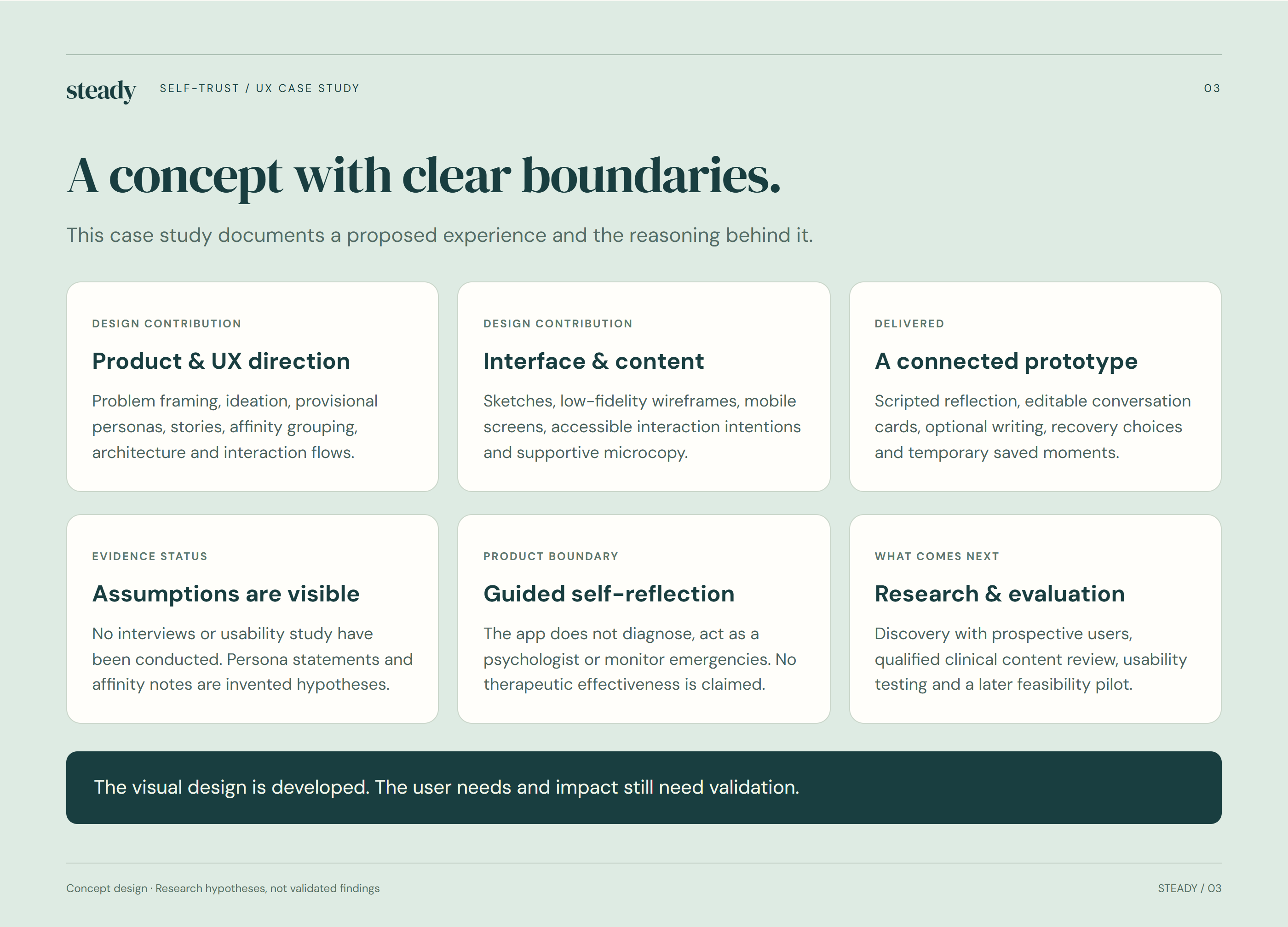
A concept with clear boundaries.
The design scope includes problem framing, provisional personas, experience mapping, information architecture, wireframes, visual design and a scripted prototype. Research activities are proposed, and the personas and scenarios are fictional. The concept offers self-reflection support; it does not provide diagnosis or replace a psychologist.
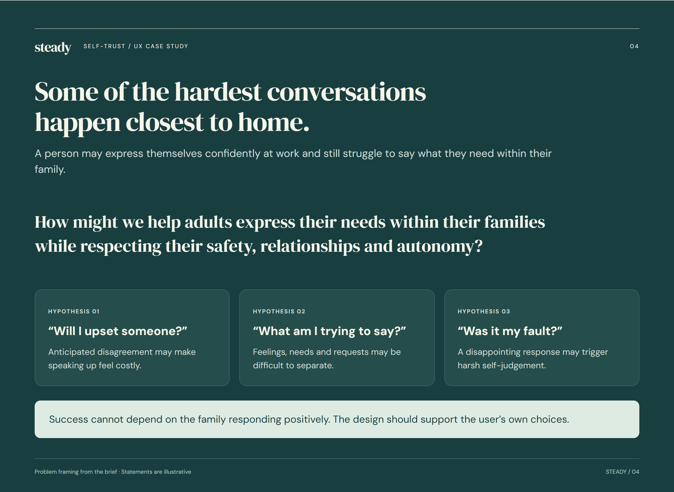
Some of the hardest conversations happen closest to home.
Confidence can change with context. Someone who speaks freely at work may hesitate when asking a family member for quiet time, help or a different boundary. This concept focuses on those everyday moments, recognising that hesitation may reflect relationship dynamics as well as uncertainty about what to say.
Start with lived moments.
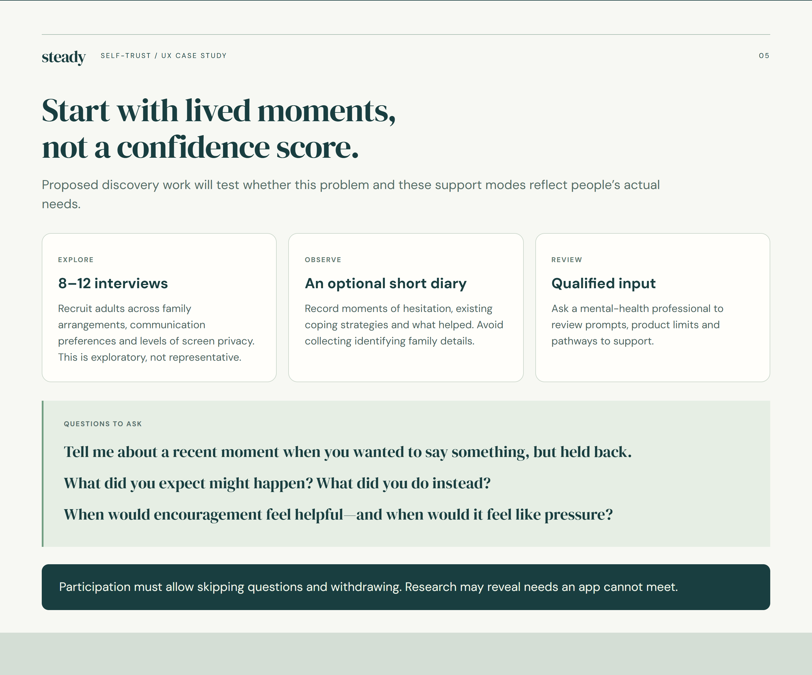
Start with lived moments, not a confidence score.
Discovery would begin with concrete experiences: what happened, what the person wanted to express and what made it difficult. Exploratory interviews, an optional diary exercise and professional content review would help test the assumptions behind Steady. These activities are a research plan, not completed findings.
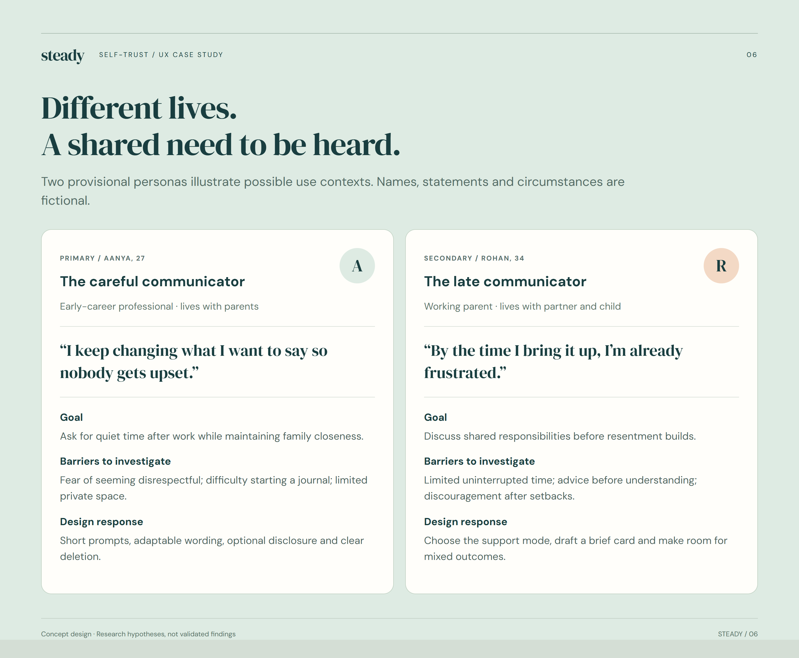
Different lives. A shared need to be heard.
Aanya and Rohan are provisional personas used to explore two possible contexts: asking for personal space while living with parents, and discussing shared responsibilities as a working parent. They help make design questions tangible. Their motivations and difficulties must be checked against real participants before informing product decisions.
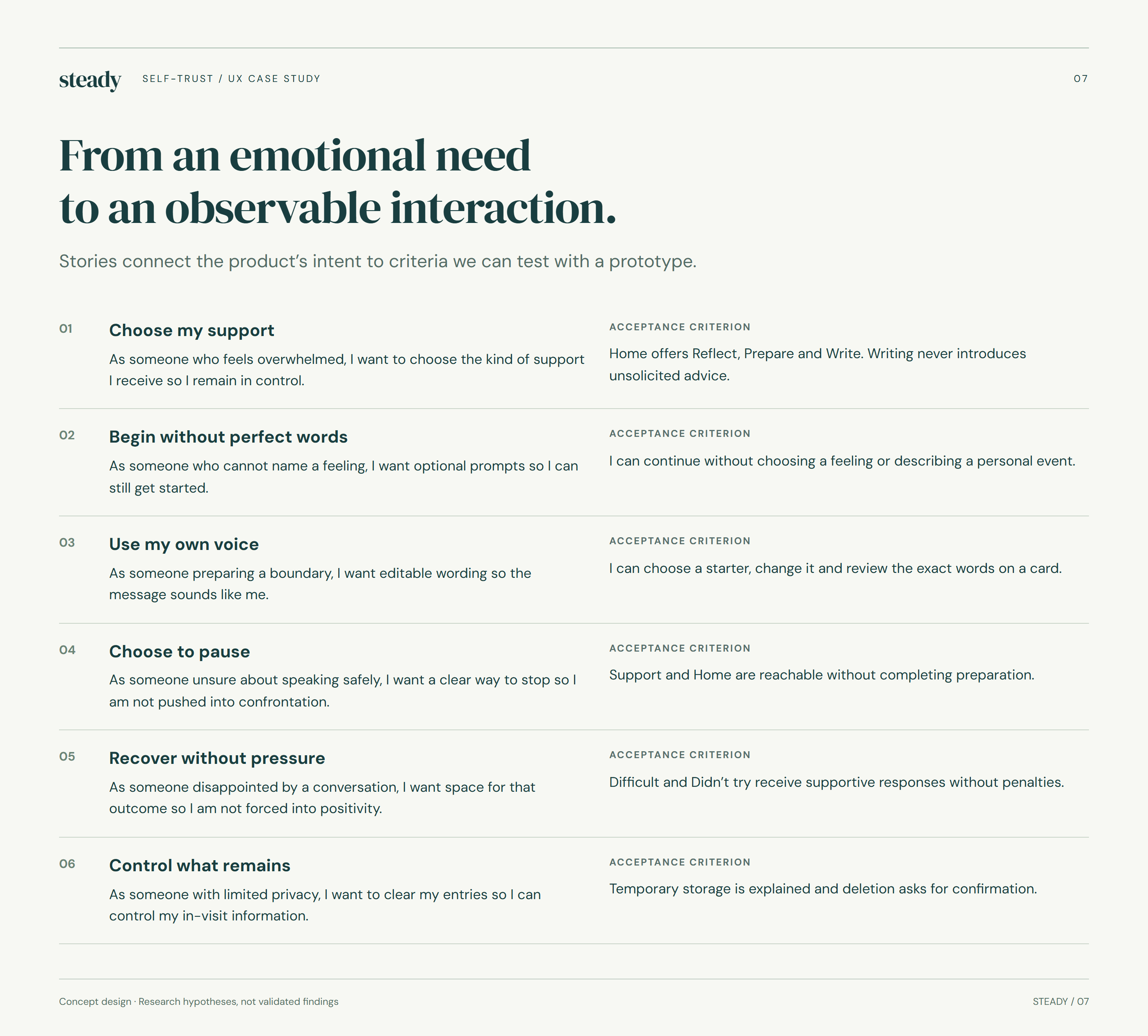
From an emotional need to an observable interaction.
User stories translate broad intentions into interactions that can be assessed. A person should be able to name a feeling, edit a suggested sentence, skip a prompt or leave without saving. These stories prioritise choice and clarity rather than assuming everyone wants to complete the same sequence.
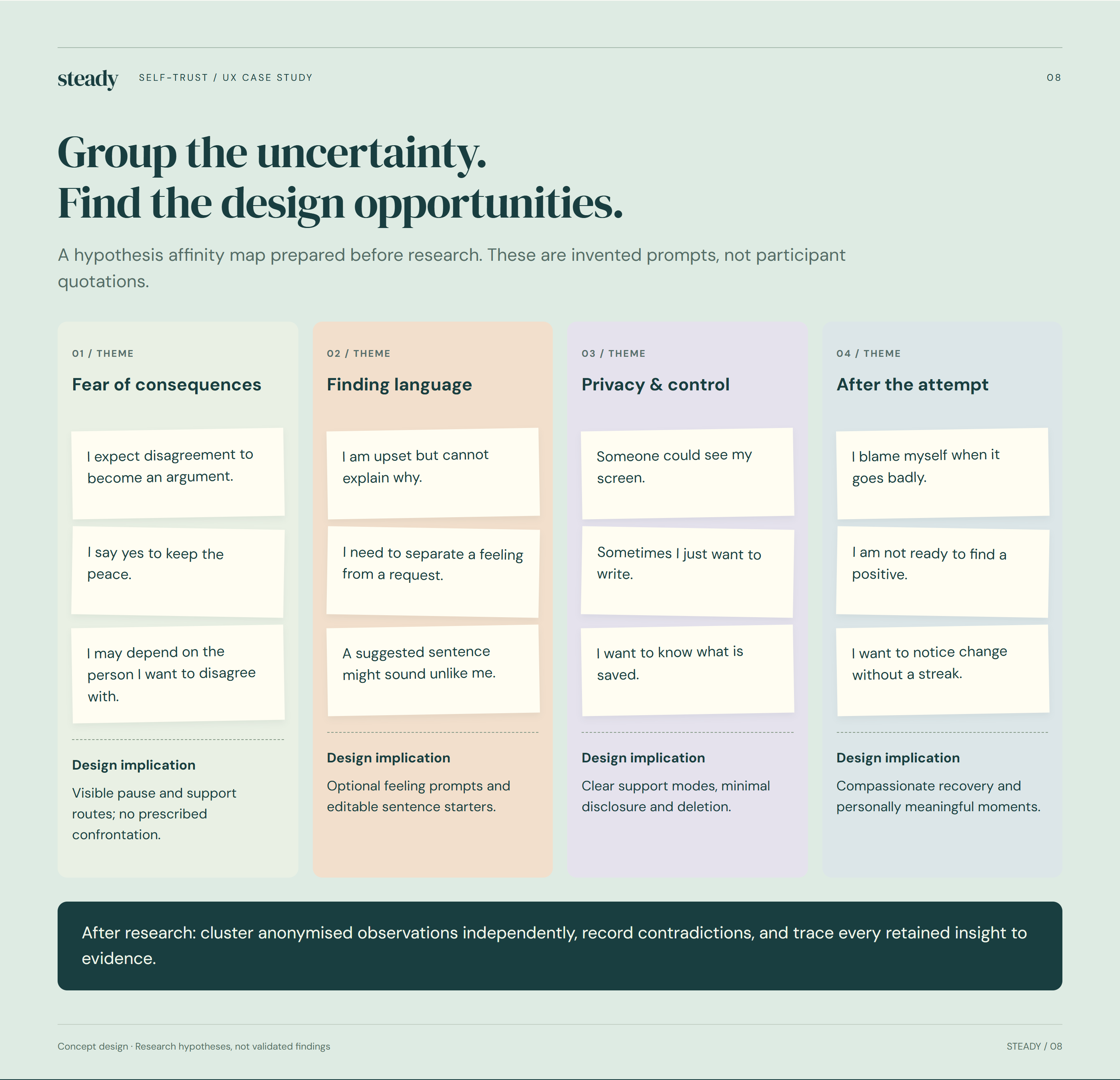
Group the uncertainty. Find the design opportunities.
The hypothesis affinity map groups possible needs around fear of consequences, finding language, privacy and support after an attempt. The notes are invented prompts, not interview quotations. Each cluster points to questions for discovery and possible design responses that may change as evidence emerges.
Choice, not pressure.
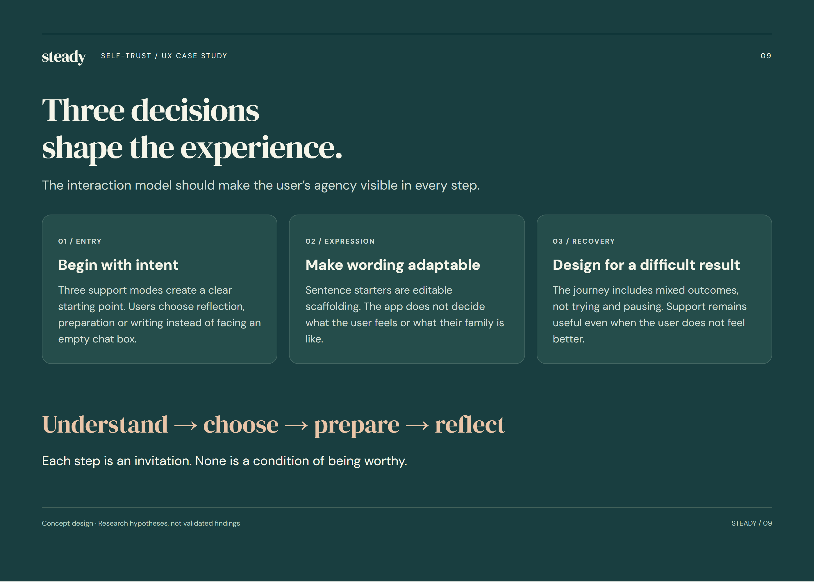
Three decisions shape the experience.
Three principles guide the concept: start gently, preserve personal choice and support the experience after a conversation. In practice, this means optional prompts, editable language and a route back to reflection. The interface should make it easy to pause or choose a different path.
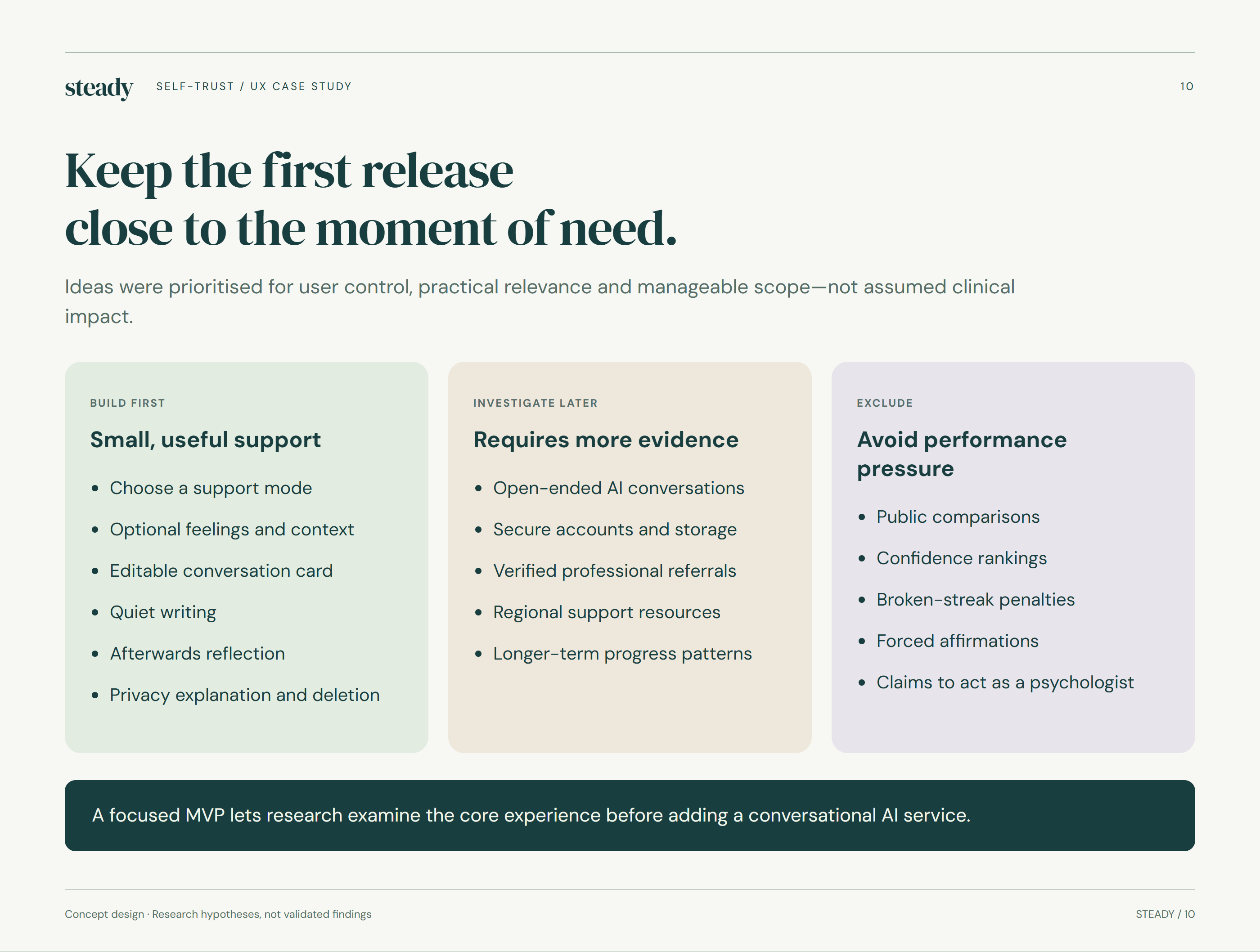
Keep the first release close to the moment of need.
The first release centres on a small set of practical activities: understanding a moment, preparing words and writing privately. Ideas were prioritised according to relevance, user control and scope. Their presence in the concept reflects a design decision, not evidence that they improve confidence or mental health.
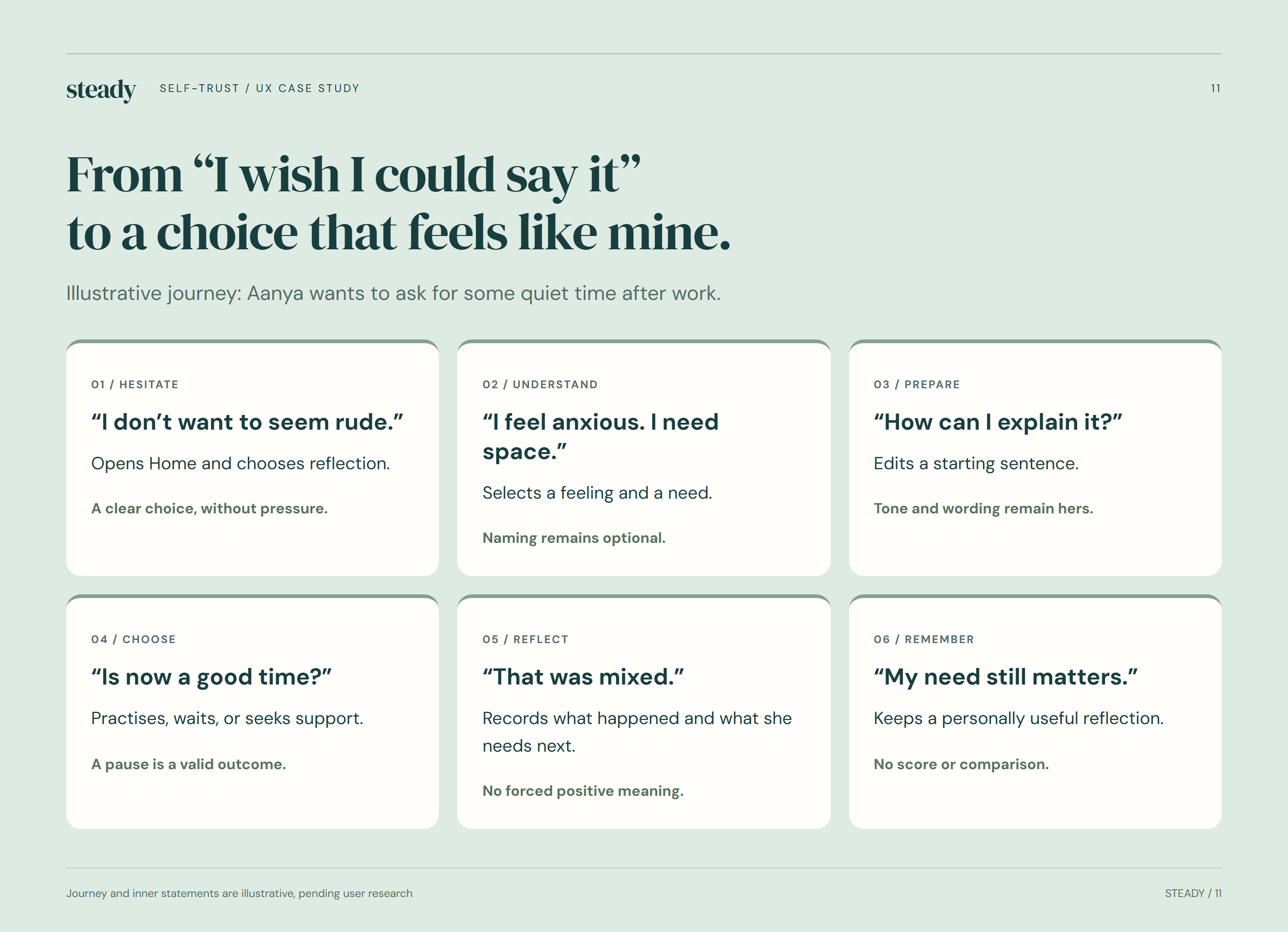
From “I wish I could say it” to a choice that feels like mine.
Aanya’s illustrative journey follows an everyday request for quiet time after work. The map considers hesitation before speaking, preparation and reflection afterwards. It also accounts for an unsupportive response, so the experience does not imply that a successful conversation is the only worthwhile outcome.
More than one way through.
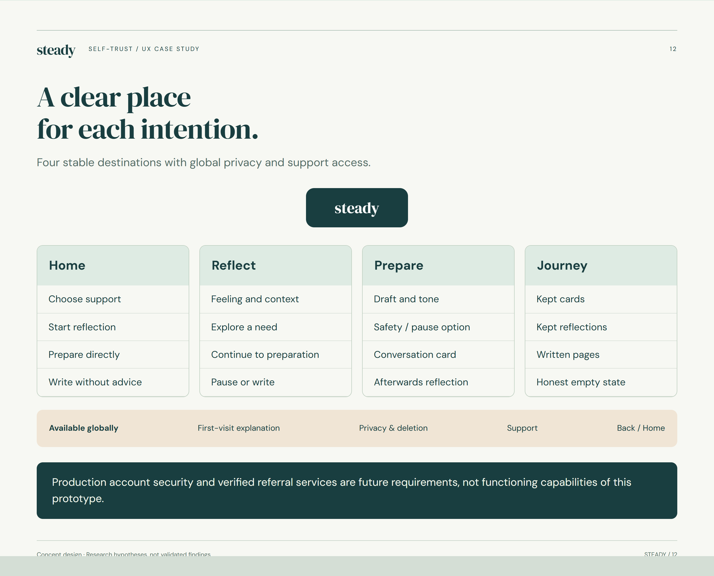
A clear place for each intention.
The information architecture gives reflection, preparation, writing and the personal journey clear places within the experience. Privacy and support remain accessible across the app. The structure aims to help someone find a useful activity without needing to understand a complex programme or complete a prescribed course.
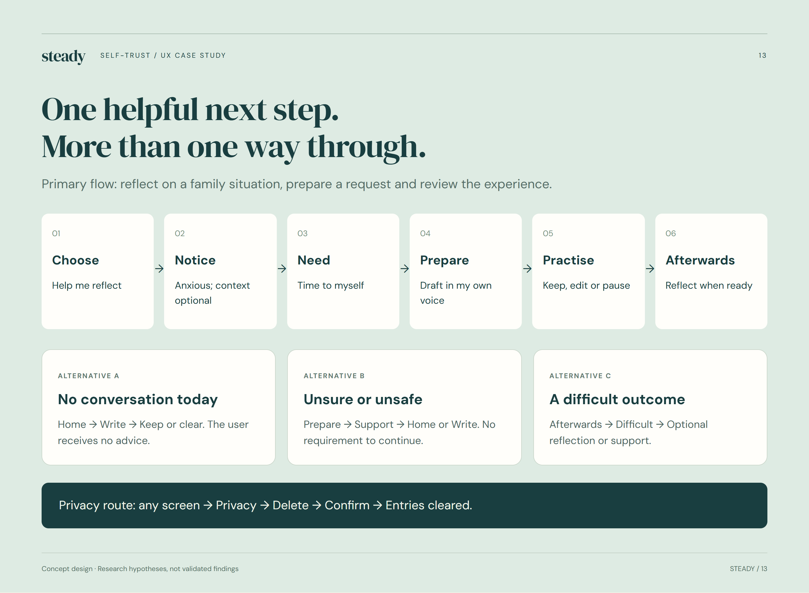
One helpful next step. More than one way through.
The main flow moves from a family situation to reflection, a draft request and an optional review. Branches allow the person to edit, skip, pause or continue writing. These alternatives acknowledge that preparing to express a need does not mean someone is ready—or feels safe—to say it aloud.
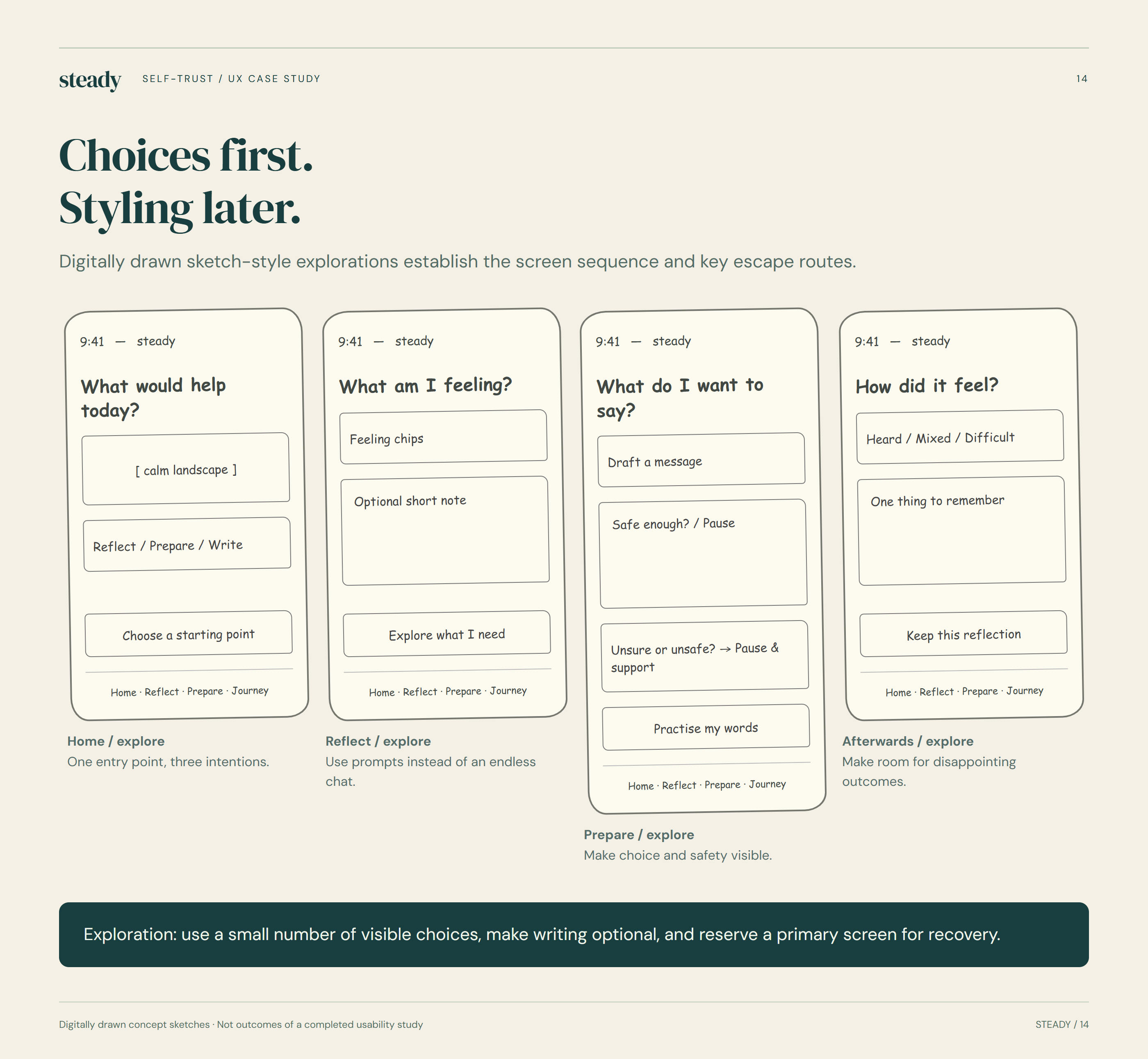
Choices first. Styling later.
The sketch-style explorations focus on sequence and action before colour and typography. Each screen considers what someone needs at that moment and how they can move on or step away. These are digitally drawn design explorations, showing the early structure of the proposed experience.
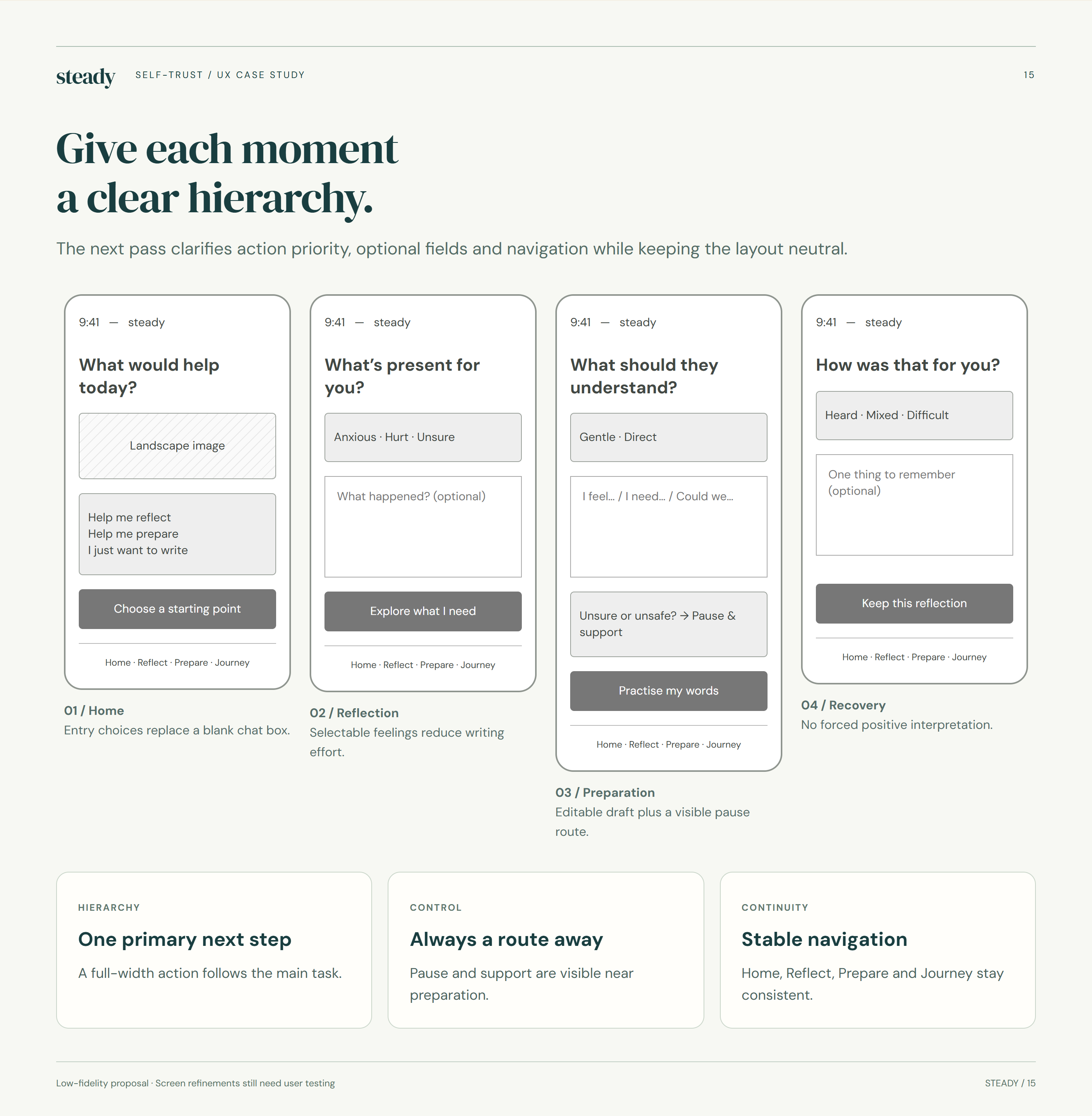
Give each moment a clear hierarchy.
Low-fidelity wireframes refine the hierarchy: one clear primary action, visible alternatives and optional fields. The neutral presentation keeps attention on language and navigation. Testing this stage would help reveal whether prompts feel understandable and supportive before investing further in visual polish.
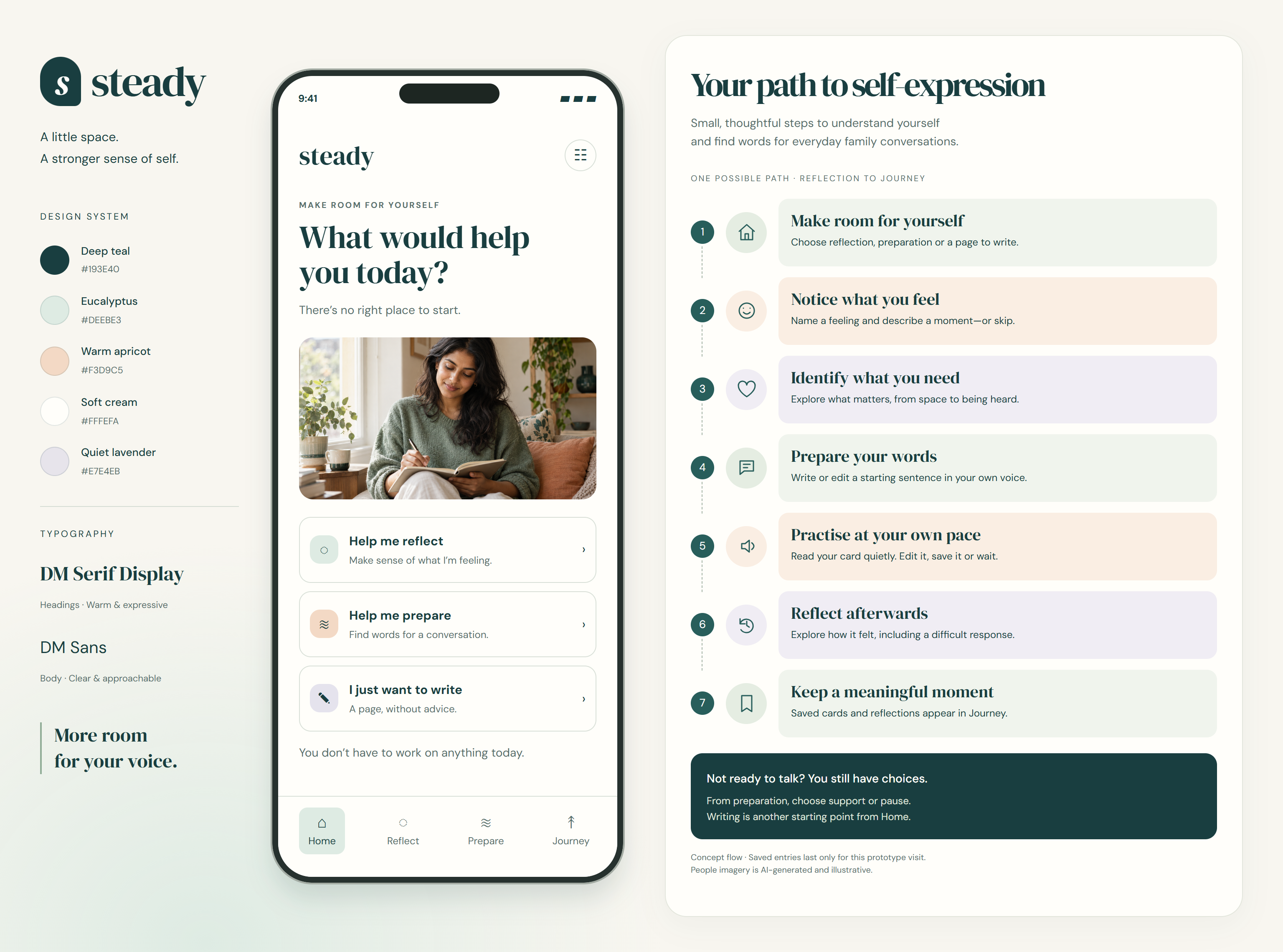
The complete user flow
A possible journey through reflection, preparation and a saved moment, with room to pause or choose another starting point.
A quieter visual language.
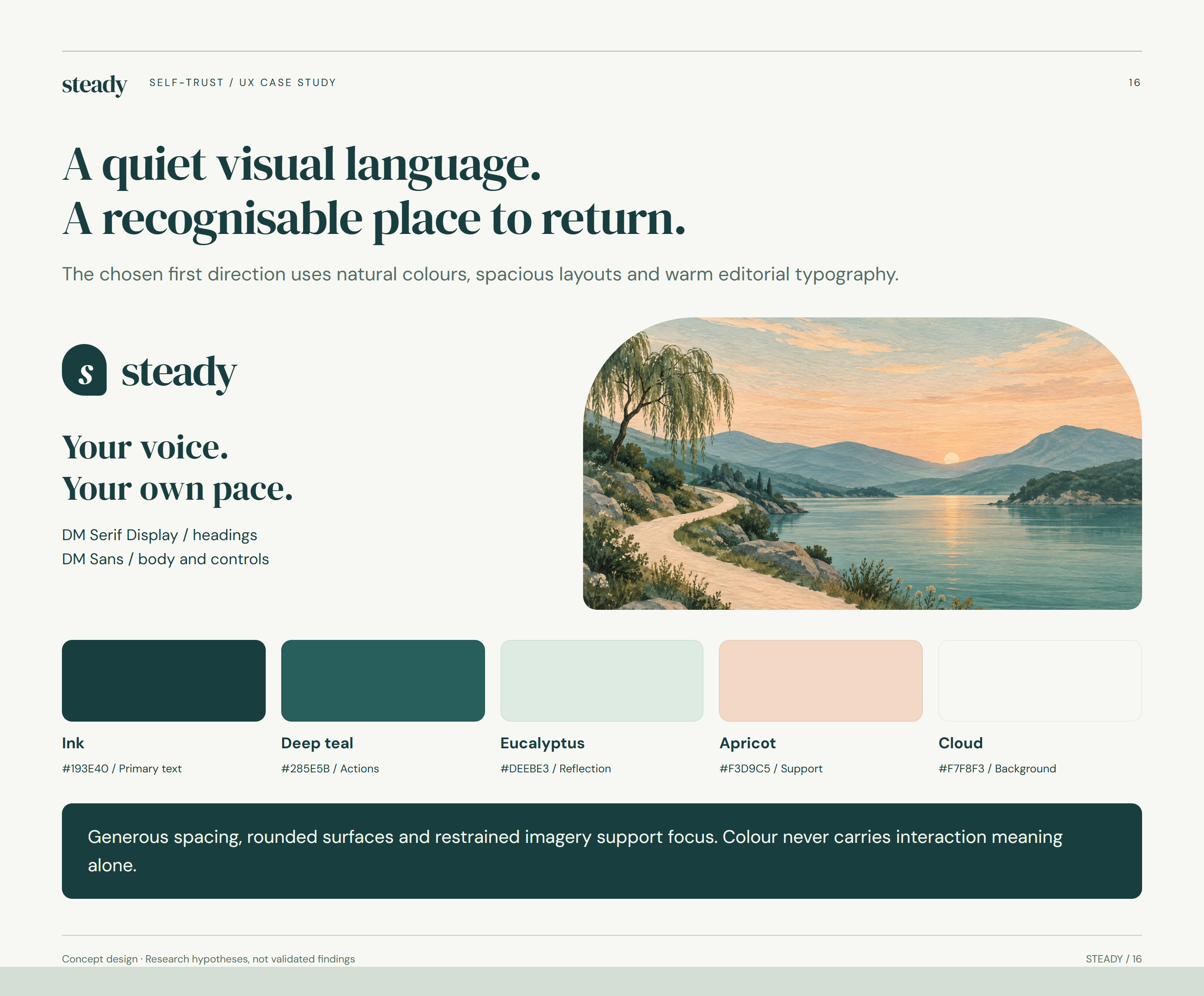
A quiet visual language. A recognisable place to return.
The selected visual direction pairs warm cream with deep teal, eucalyptus and apricot. DM Serif Display adds warmth to headings, while DM Sans supports clear interface text. The landscape illustration creates a quiet recurring visual theme. This retains the original Steady direction chosen for the project.
Reflect. Prepare. Write.
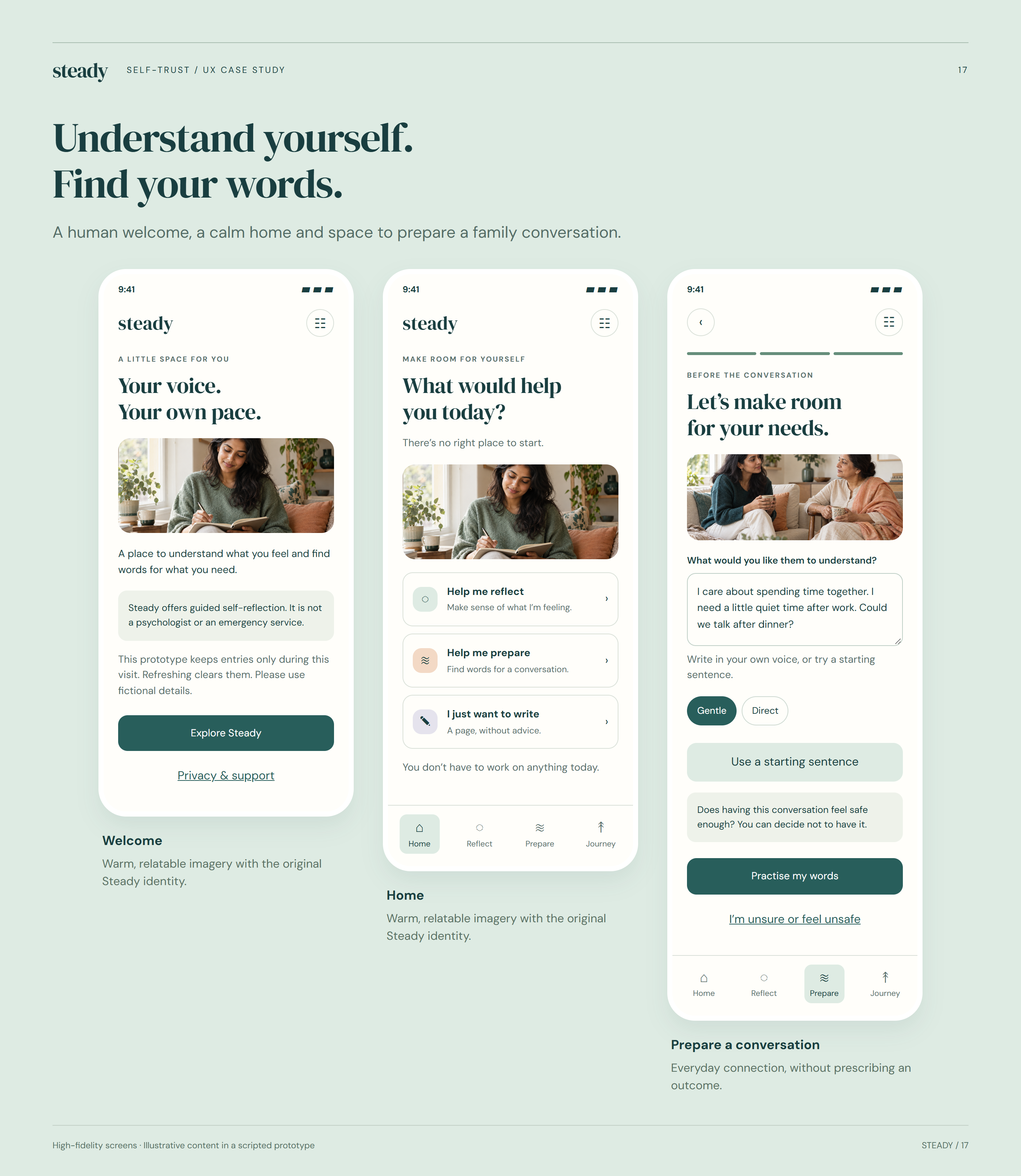
Understand yourself. Find your words.
The core screens connect emotional reflection with practical preparation. Users can begin with a feeling or a situation, then shape language in their own voice. Spacious cards and clear action labels aim to keep the interface approachable, particularly when someone arrives feeling uncertain or overwhelmed.
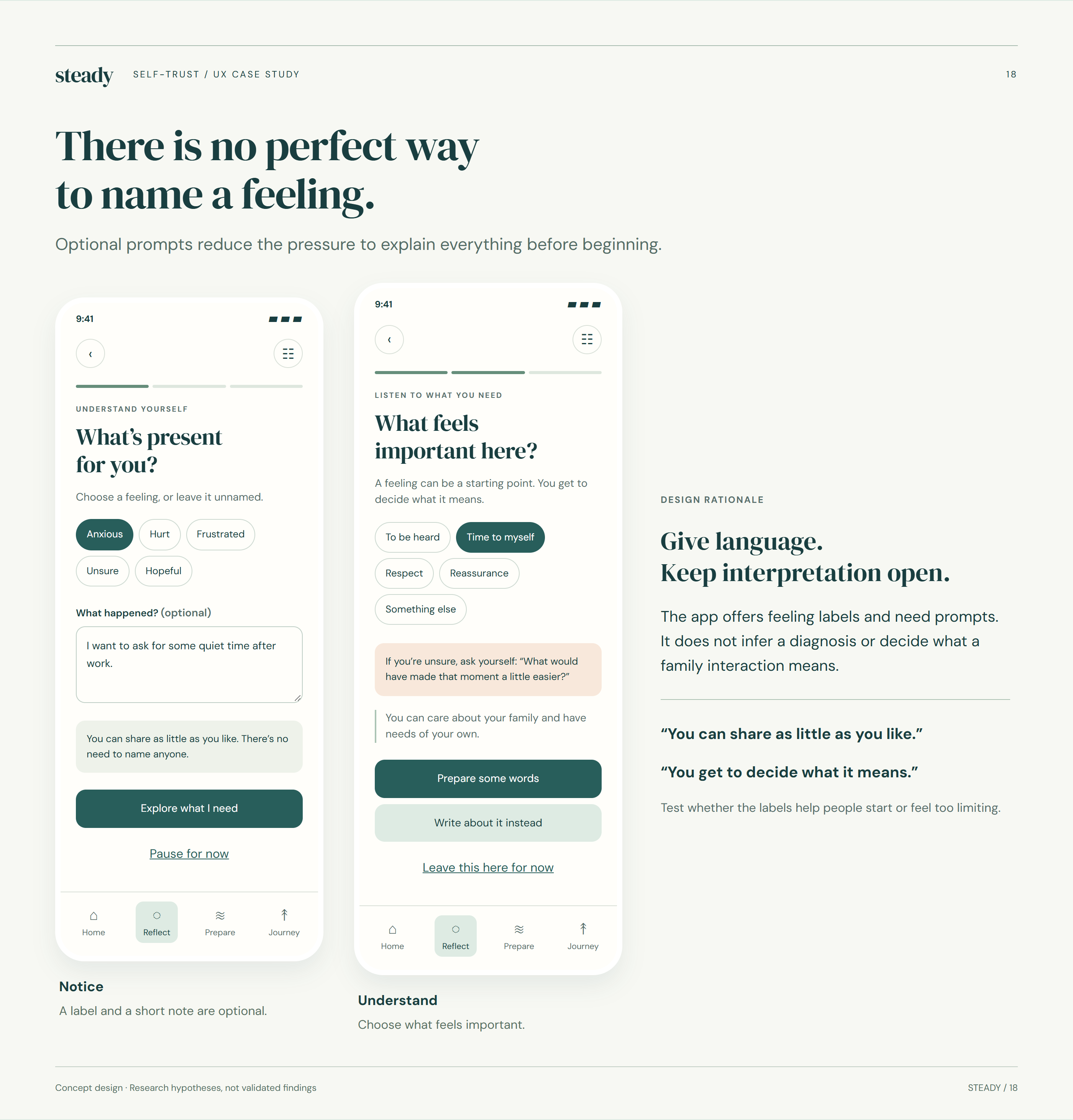
There is no perfect way to name a feeling.
Reflection invites a person to describe what happened and identify what they may need, without requiring a perfect explanation. Prompts are optional, and the flow allows uncertainty. The design intent is to reduce pressure at the starting point; usability testing would examine whether the wording achieves that.
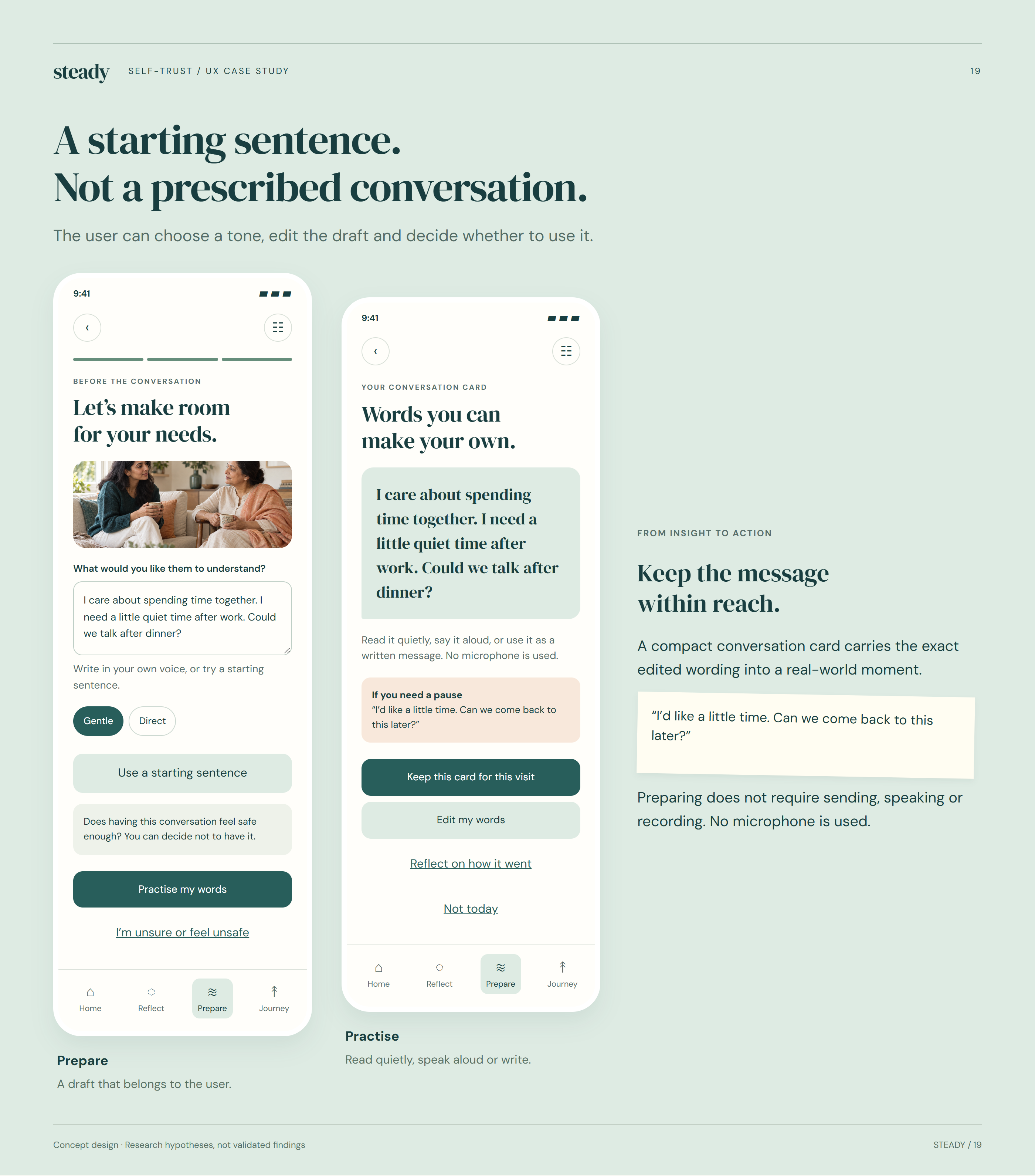
A starting sentence. Not a prescribed conversation.
Conversation preparation offers a starting sentence that the user can change. Tone choices and editing preserve personal expression, while practice creates space to consider the words before using them. The prototype uses scripted content; it does not interpret a person’s situation as a therapist would.
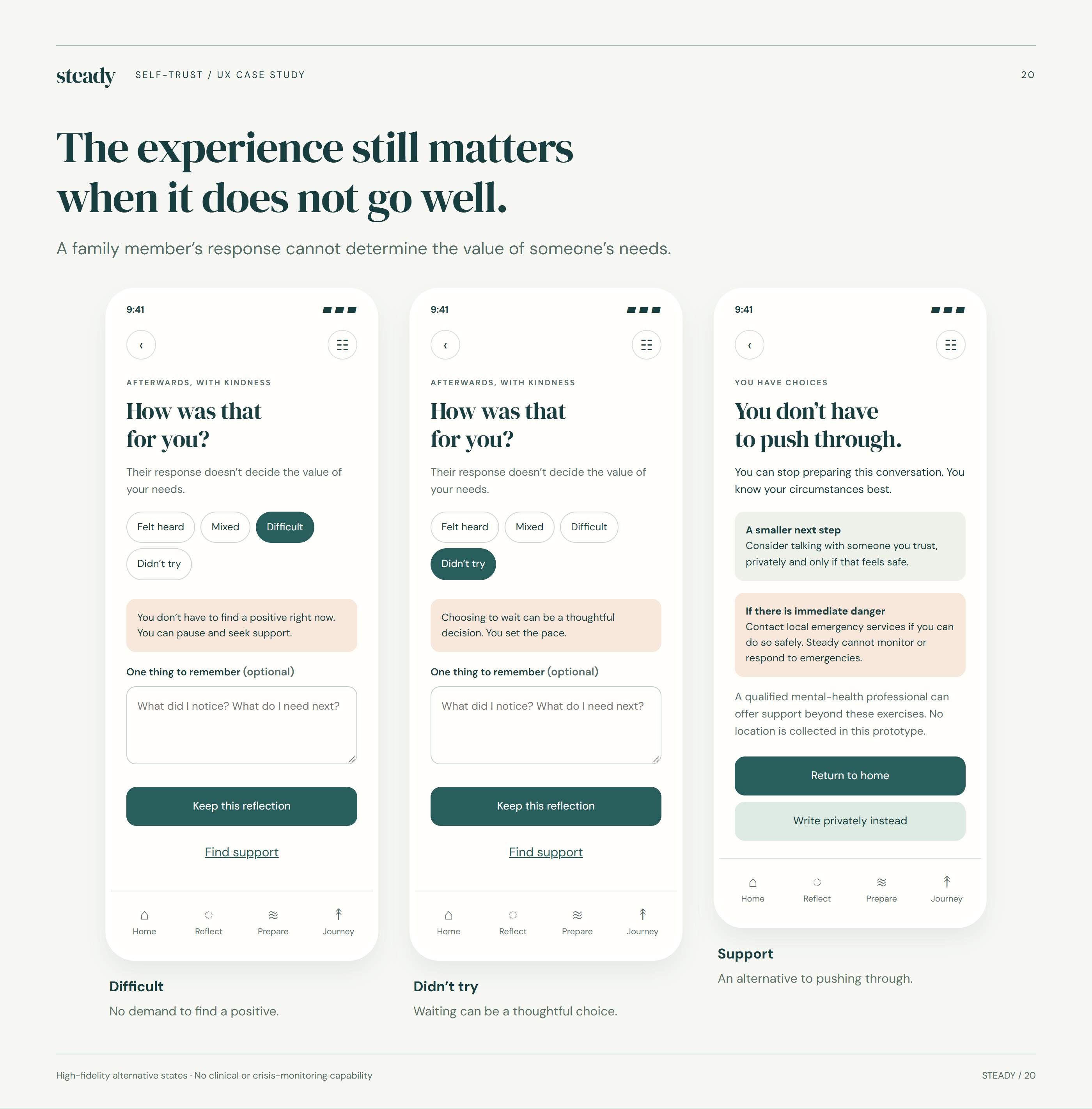
The experience still matters when it does not go well.
A difficult response should not leave the user at a dead end. The proposed recovery screens offer space to reflect, pause or seek support. They avoid treating another person’s reaction as a measure of progress and recognise that repeating or escalating a conversation may not be appropriate.
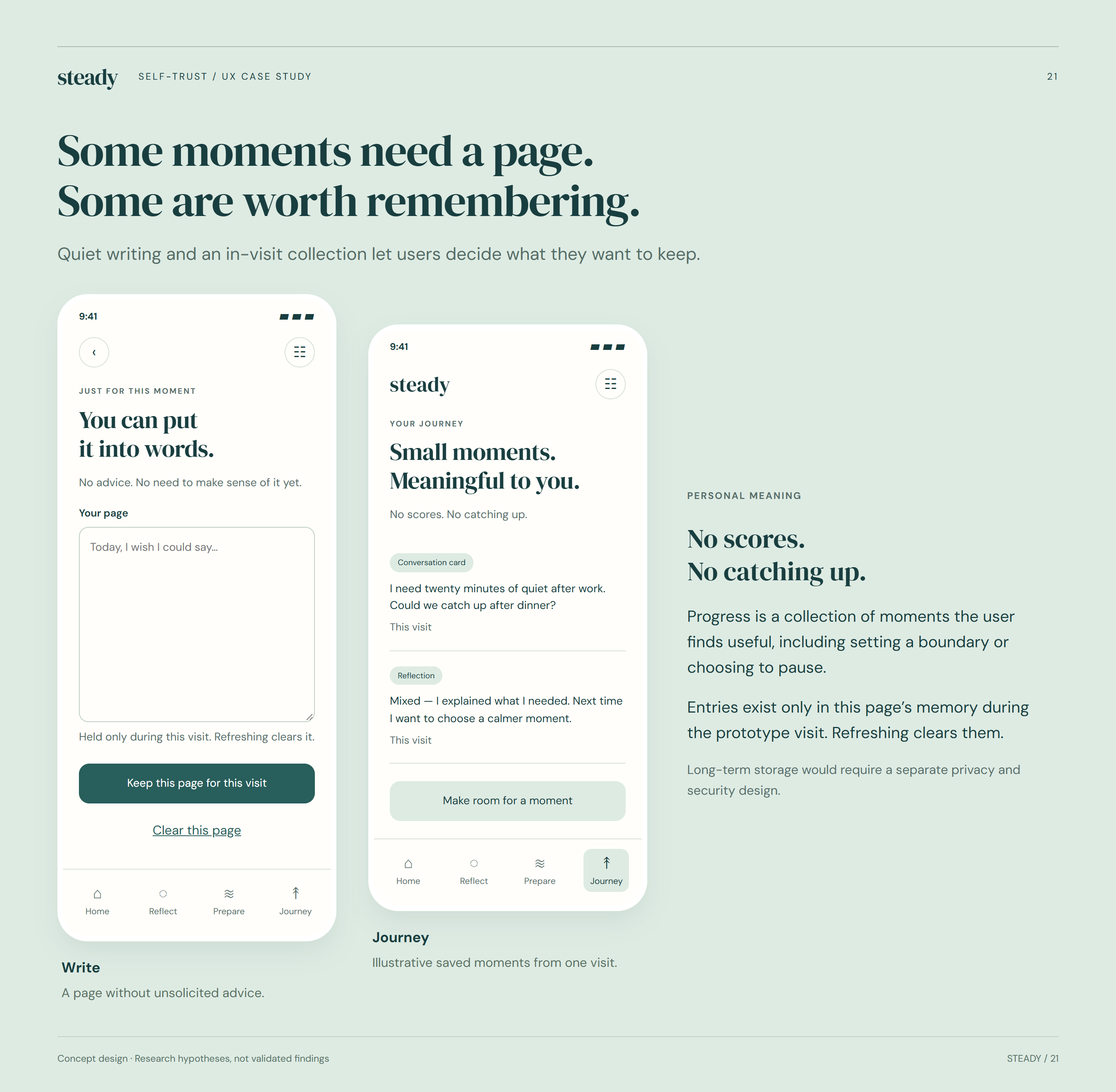
Some moments need a page. Some are worth remembering.
Writing provides an open alternative to guided prompts, while Journey lets users revisit selected moments during the prototype session. The current prototype keeps entries in memory only. Persistent storage, meaningful privacy controls and clear deletion behaviour would need to be designed and verified before a real release.
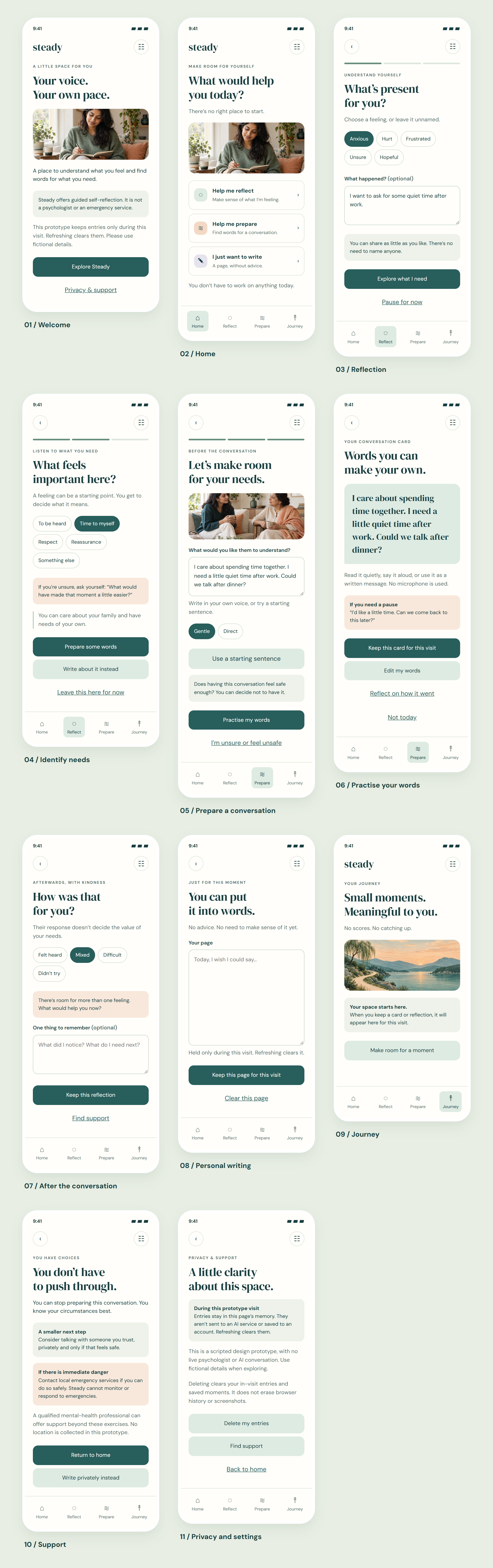
All 11 designed screens
The complete interface, including illustrative AI-generated people imagery.
The system behind
the screens.
Explore a calm visual system, accessibility decisions, key journeys, reusable components and final screens for Steady in one browsable reference.
Trust lives in the details.
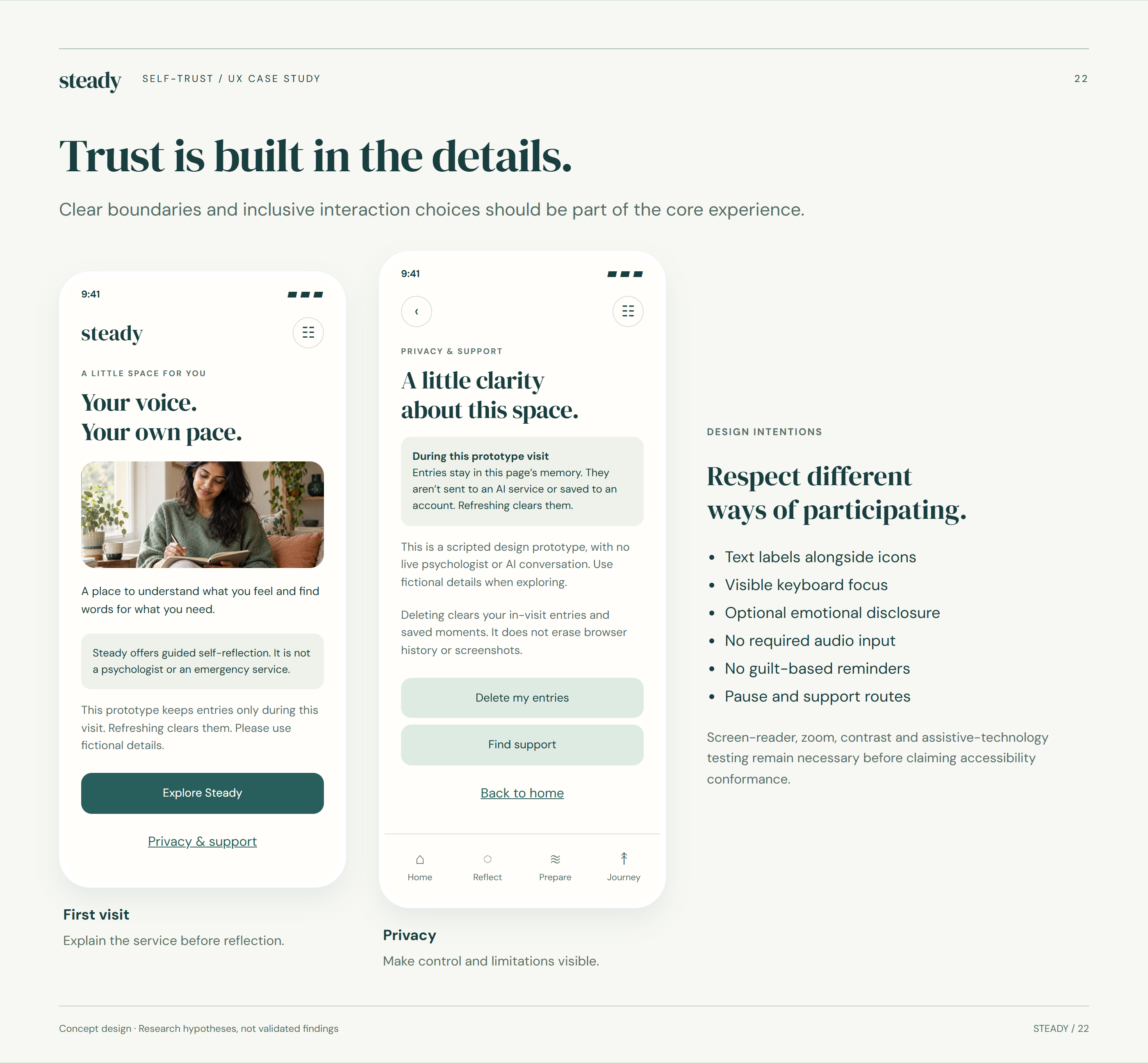
Trust is built in the details.
Trust depends on understandable boundaries as much as visual tone. The concept includes privacy and support access, readable hierarchy and options to skip or leave. Accessibility, assistive-technology behaviour and the emotional impact of the content require further evaluation; these boards do not establish compliance or safety.
An open research question.
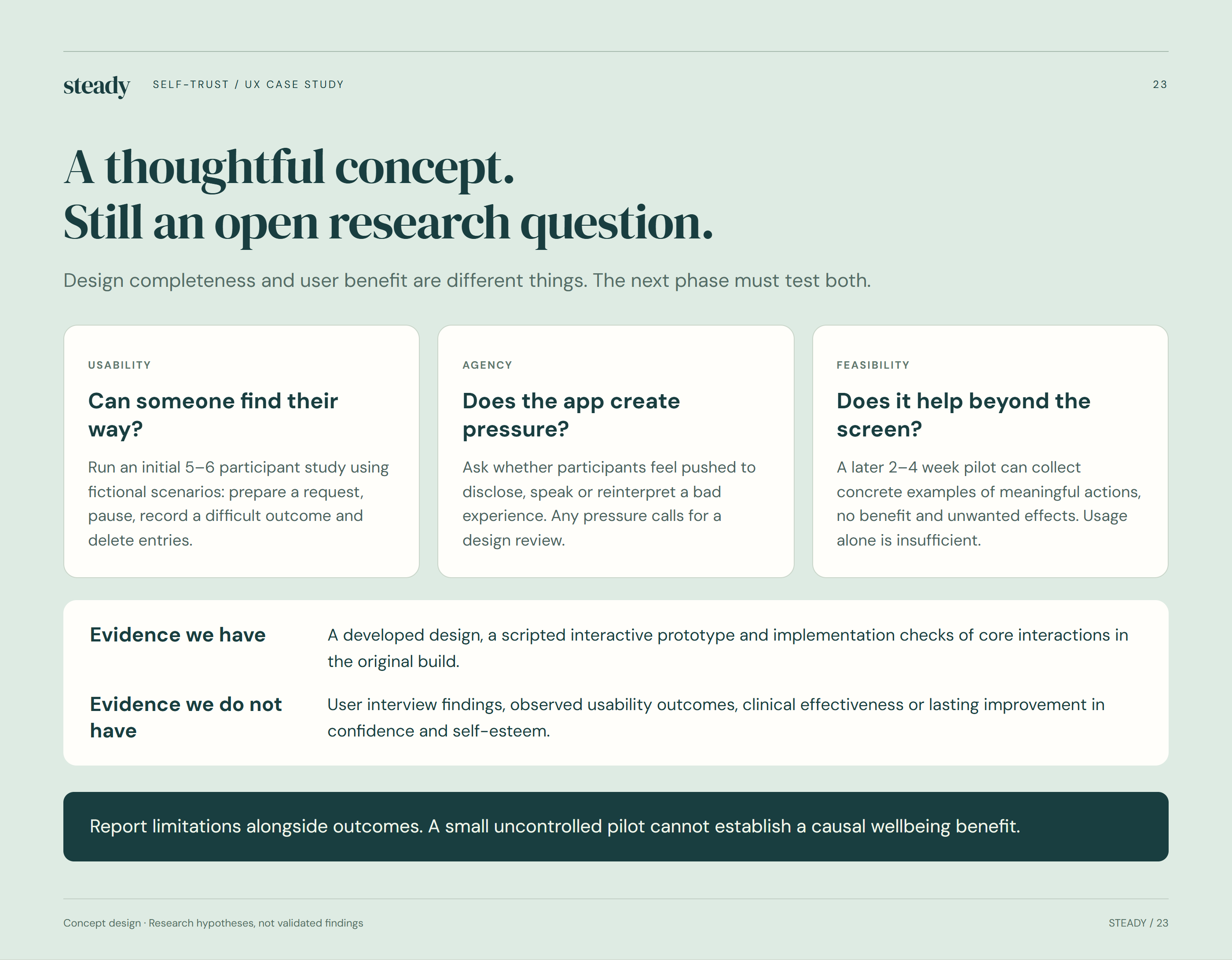
A thoughtful concept. Still an open research question.
The next phase would test whether people understand the app’s role, can complete key activities and retain a sense of control. Usability sessions would inform revisions before any longer feasibility study. No usability results or improvements in confidence are claimed in this concept case study.
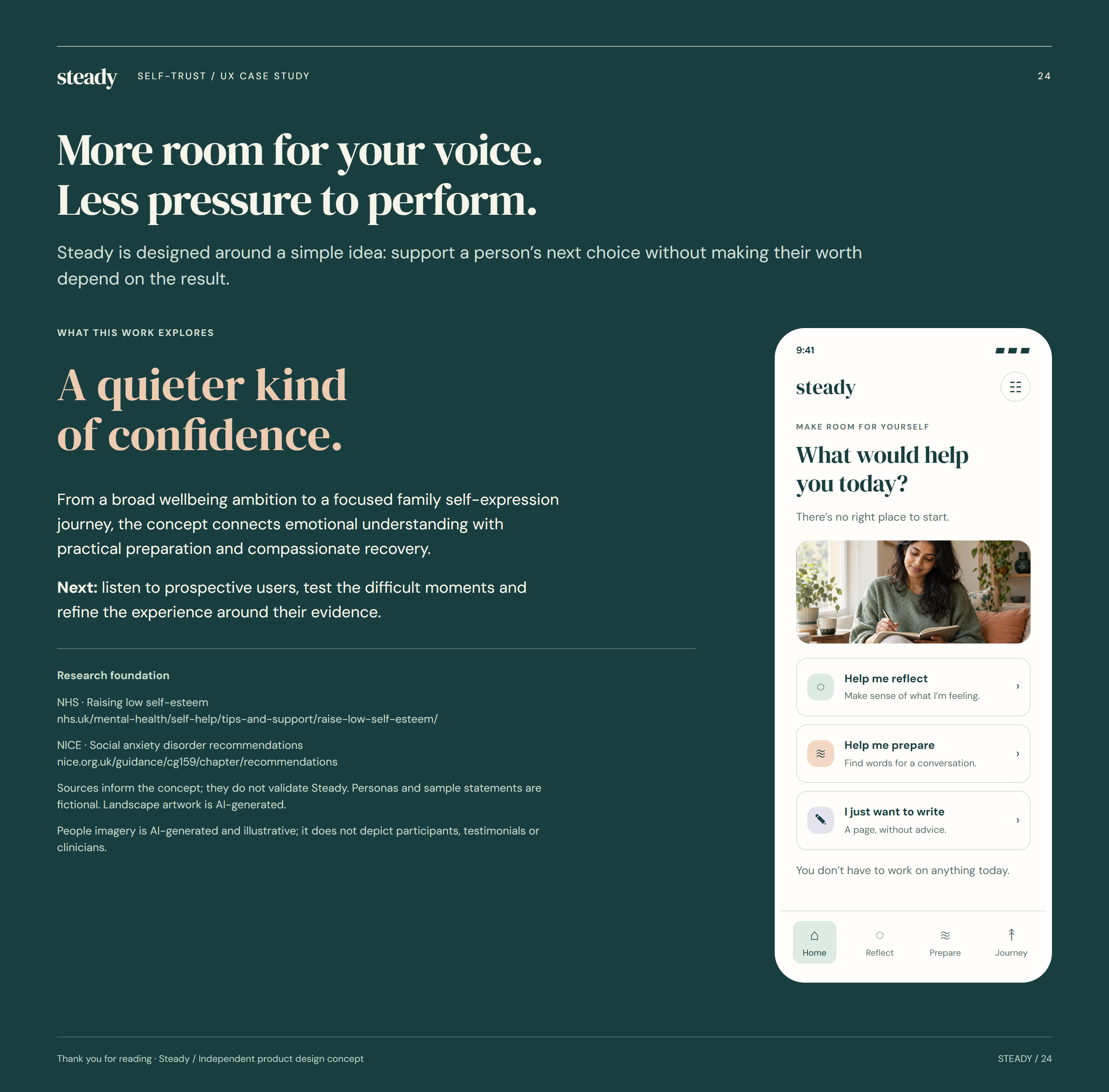
More room for your voice. Less pressure to perform.
Steady’s central design idea is to support a person’s next choice without tying their worth to the result of a conversation. The project demonstrates a proposed experience and visual system. Further user research, accessibility testing and professional content review would determine how that idea should develop.